Featuring Art from a Naber Designs home

Hey everyone! Nicole from En Shell back again.

Get ready to save some sources and add to your Pinterest boards. This post is goodie! When Abbie texted me asking me what my thoughts were on doing a blog post about artists she has in her home, my immediate response was YES let’s do it…give the people what they want! Seriously though, I know we all have been soaking up every photo of her latest home addition, am I right? 

Abbie is known for her artistically-forward interiors that feel layered, lived-in, and comfortable while still having that California-cool factor. Her designs are known for feeling effortless, relaxed, approachable, and fresh. A crucial element in every room is art, and it is easy to spot an a Naber designed space due to the art-focused walls, airy and warm color palette, and the light and bright feel. Abbie is one of those designers we all follow not only for her stunning designs but also because she is always in the know of the coolest artists, makers, and creators. Not only that, she is always spreading the love and sharing the knowledge on social media so that we can all step up our interior game, too. 

So without further ado, take a scroll below, and checkout a room-to-room tour of Abbie’s personal art collection. Enjoy!

Living Room: 1. KADER BOLY / Photography: Charlotte Lea

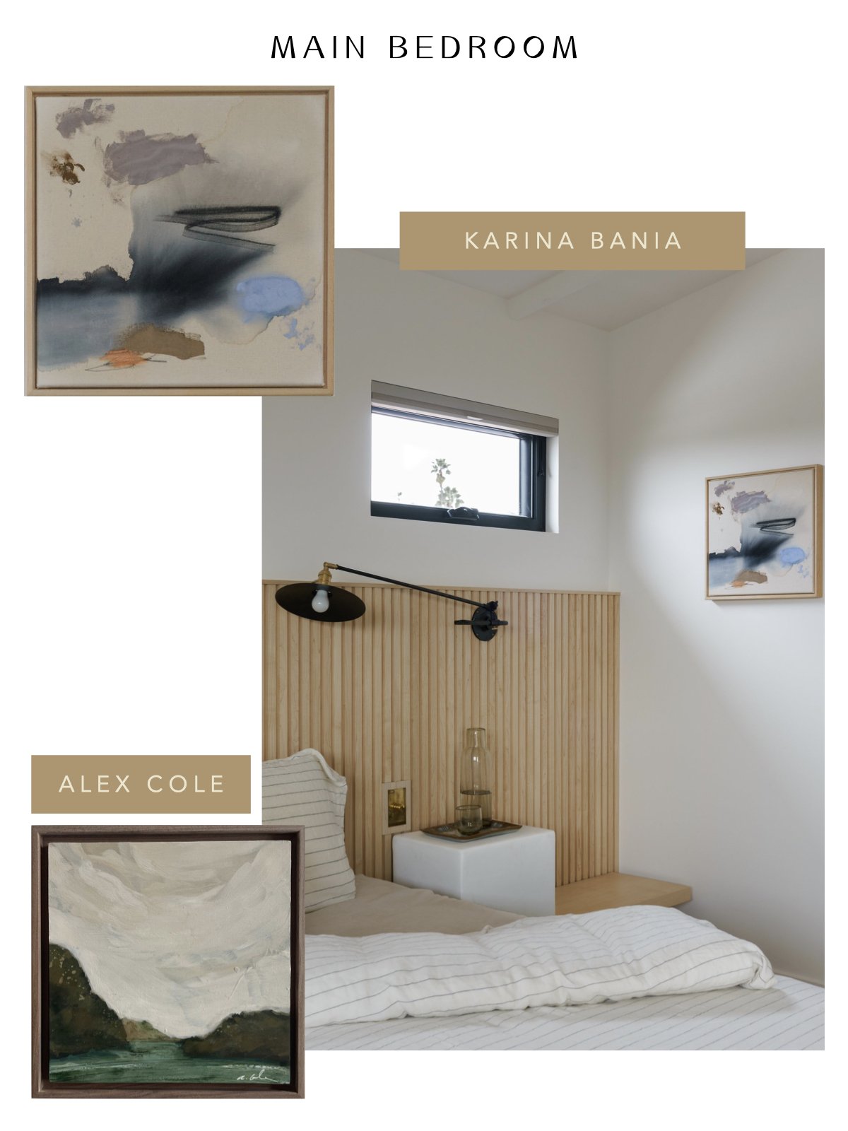
Main Bedroom : KARINA BANIA / ALEX COLE / Photography: Charlotte Lea

Main Bedroom: WHITEWOOD CANVAS / Photography: Charlotte Lea

Home Office: ART DE AVALO / Photography: Charlotte Lea

Home Office : ELISSA BARBER / Photography: Charlotte Lea

Husbands Office: SCOTT KERR / Photography: Charlotte Lea

Upstairs Hallway: JOY KINNA/ Photography: Charlotte Lea

LEO’S NURSERY: WEST PERRO / CALIFORNIA CASA/ MEL REMMERS / ROBYN PARKER / KALEEN CAMERON / Photgraphy: Charlotte Lea

TRENDING: ALL THINGS PLYWOOD

Hey, everyone! It’s Nicole from En Shell here delivering some blogging goodness.

You know we are big fans of keeping things minimal but with a fun twist over here. That’s why there has been one humble yet playful material that we’ve been experimenting with lately. It’s a material that is timeless yet is having a major moment in utilitarian areas of the home, like laundry rooms, offices, storage areas, and kitchens. We are talking about plywood, people!

It's safe to say plywood is really catching our attention these days. We’ve compiled a few favorite uses of plywood used in interiors, and you better believe we included a couple of photos from Abbie’s projects and personal home. Loving the look? Check out a few furniture and decor items that have us swooning! Who says plywood can’t be chic?

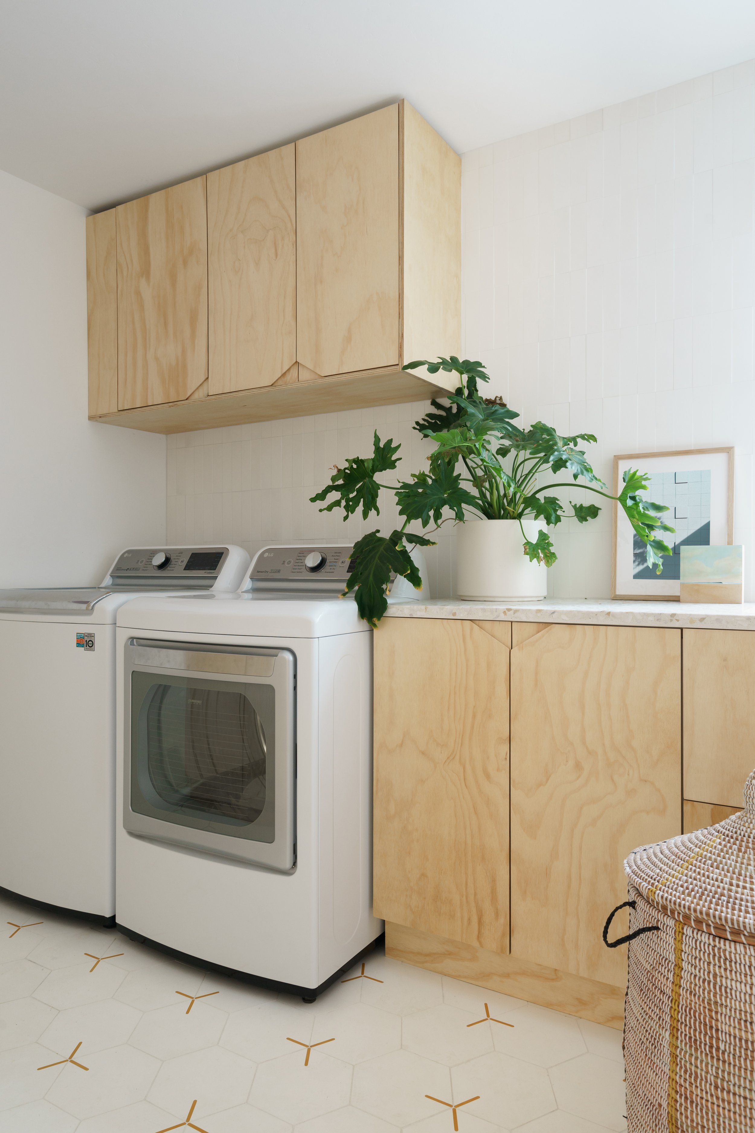
You all have probably seen plywood have a major moment in Abbie’s Project Cathy. Abbie is even using this unfussy substance in the laundry room and office of her home, too. 

Project Cathy: Custom Build: Rice Modern / Design: A Naber Design / Photography: Charlotte Lea / Styling: En Shell and California Casa

Project Cathy: Custom Build: San Diego Custom Cabinets / Design: A Naber Design / Photography: Charlotte Lea / Styling: En Shell and California Casa

aND Addition: Custom Desk by Rice Modern / Design: A Naber Design/ Photography: Charlotte Lea / Styling: California Casa and Erica DeLorme

Sure, at first glance, this simple-looking material might not have the most eye-catching allure, but that’s exactly what we love most about it! It’s informal, laidback, and effortlessly cool, yet it can still feel sleek, clean, and streamlined depending on the other types of materials paired with it. Better yet, plywood is on the more inexpensive and sustainable side of building and interior materials. 

aND Addition: Custom Cabinets: Rice Modern/ Design: A Naber Design / Photography: Charlotte Lea / Styling: California Casa and Erica DeLorme

Keep things easy and lean into plywood’s casual nature by leaving it raw and unfinished. Paint or stain the wood for a more bold and dramatic approach. When it comes to cabinetry, pair plywood with hardware to elevate its style and feel, or nix the metals and go for a “no hardware” look by using cutout shapes as cabinetry pulls - think mouse holes, u-shapes, or triangles. Believe us, once you open the creativity portal and are willing to experiment, the options are endless. Not only is plywood used for interior elements, like cabinetry, shelving, and walls, we're loving the relaxed feel this material brings to accent elements, like furniture and home decor, too. It is an excellent choice if you are looking for a more budget-friendly upgrade.


TRENDING: PLASTER

Trending: Plaster

Hi Everyone,

Nicole (En Shell) here!

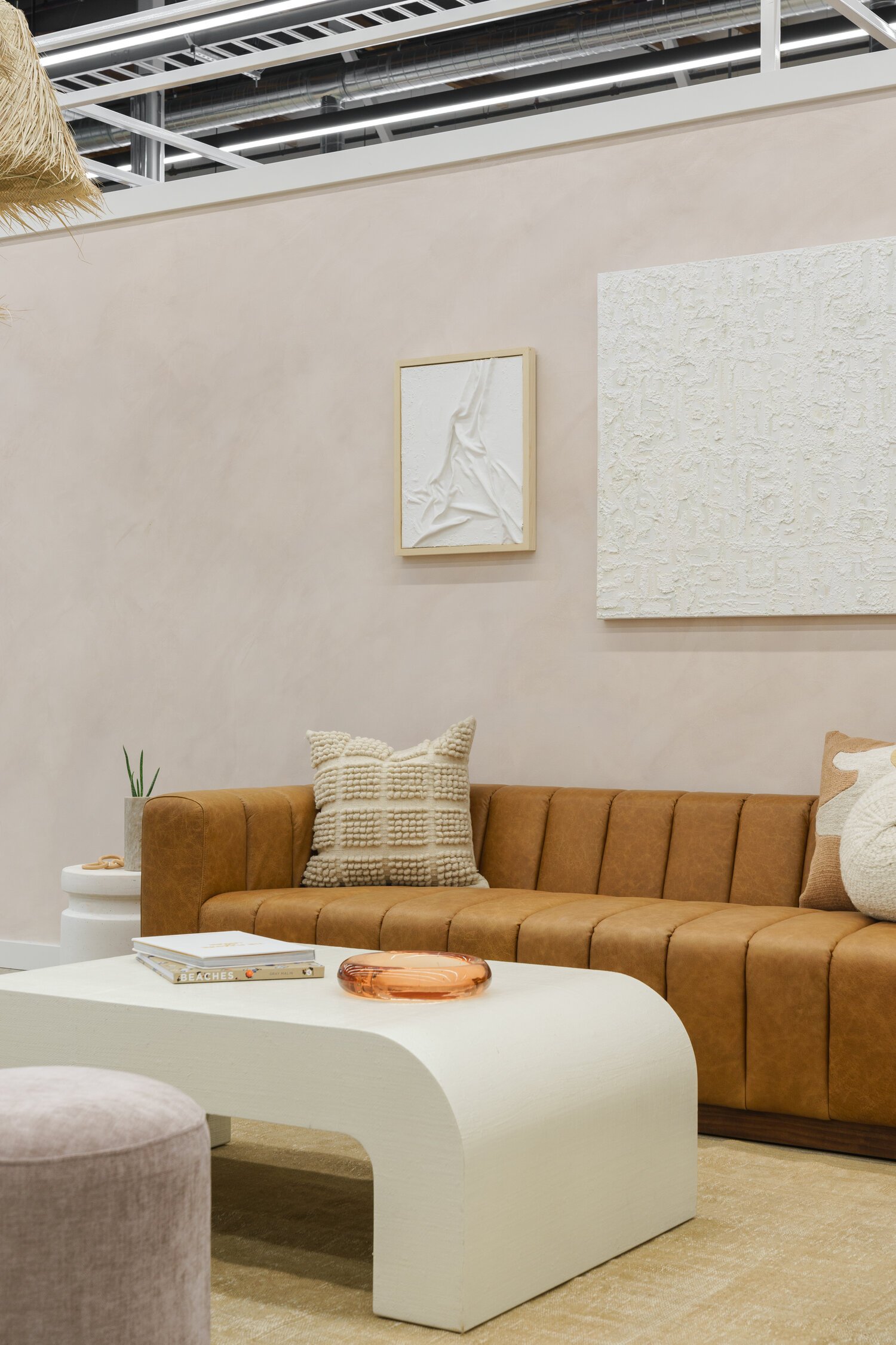
Well, we all know we are big fans of anything with great texture over here. Even better, we are big fans of textures that feel subtle, natural, and organic. One material that is currently trending and checks all these boxes is plaster. Based on the application, plaster can add depth and dimension but can also feel smooth and effortless. Plaster is not just for walls, either. We are seeing it used in a variety of ways inside the home, for example, fluted kitchen islands, fireplace fabrication, range hoods, and shower walls, to name a few. On a less permanent and more approachable side, plaster is now trickling its way into furniture, lighting, wall art, and décor, too. These smaller and more interchangeable pieces are a great option if you do not want to commit to a full wall treatment but still want a material mix with that same effect. Plaster's soft and clean appearance and earthy grain quality make it quite versatile, allowing it to work for home aesthetics of all types: modern, minimal, relaxed, or refined.

Project With A View: Plaster Table by Okenhouse Studios / Photography: Charlotte Lea

Project Gregory: Plaster side table by Okenhouse Studios/ Photography: Charlotte Lea

Yep, you better believe Abbie has dabbled into the plaster lighting, furniture, and art game a time or two. We’ve got photographic evidence to prove it. (A big shout out to Oken House Studios, a forever a. Naber Design favorite!)

Project With A View/ Plaster Lighting by Plasterstudio LT/ Photography: Charlotte Lea

L Space Swim Headquarters/ Plaster Art by Kari Kroll and Art D’Avalo/ Photography: Charlotte Lea

We did some shopping around and gathered a few plaster furniture and décor pieces that are timeless and clean but still feel stylish with a modern edge. The holidays are approaching quickly, so now is the perfect time to pass a few of these ideas along to receive some of these beauties under your tree… just saying!

SPOTLIGHT ON: Artists that we love...

Hey all! Nicole from En Shell here with another dose of design chats. I think we are due for a good round- up on the ole blog! Let’s talk art. Art is one of the best ways to infuse character and bits of personality into the home. If you follow along on Instagram, you may have seen Abbie advocate a time or two about the importance of investing in original art, and we are here to say it again! If you are able to budget for original art, DO IT, FOLKS! It can take a home from feeling like a stark, blank box to feeling refined, special, and one-of-a-kind. There is nothing better than receiving museum-quality inspiration from the walls within your own home, and supporting the creative minds of the artists and makers makes it all the better. Find what speaks to you, what connects with you, and what visually brings out positive and soothing emotions within you. Think of art as being a version of therapy. Have we convinced you yet? We sure hope so! So by popular demand, we’ve rounded up a few a. Naber Design tried-and-true favorite artists. Abstract, calming, or bold, be prepared to want to deck your walls with some special investment pieces.

Project Gregory/ Art by LRNCE/ Photography: Charlotte Lea

Project Gregory/ Art by LRNCE/ Photography: Charlotte Lea

Project with a View/ Art: High Desert Studio/ Photography: Charlotte Lea

Project with a View/ Art: High Desert Studio/ Photography: Charlotte Lea

Project Keep it Neutral/ Art: Kader Boly/ Photography: Charlotte Lea

Project Keep it Neutral/ Art: Kader Boly/ Photography: Charlotte Lea

Project Gregory/ Artist: Maja Dlugolecki/ Photography: Charlotte Lea

Project Gregory/ Artist: Maja Dlugolecki/ Photography: Charlotte Lea

L Space HQ/ Art: Art D’avalo and Kari Kroll/ Photography: Charlotte Lea

L Space HQ/ Art: Art D’avalo and Kari Kroll/ Photography: Charlotte Lea

MOOD: Summer Color Edit

Hi Everyone! It’s En Shell contributing to the a Naber Design blog!

Summer is so close that we can taste it! More time outside means more inspiration is being pulled from nature and the outdoors. Lucky for us on the West Coast, the California landscape always seems to be delivering some colorful eye candy whose influences seem to trickle inside, too. Who doesn’t like bringing that sense of warm sunshine and soothing earth tones into the home? We’re talking warm golden tones such as dijon and ochre, an array of soft oceanic and desert hues, and light, airy neutrals. Not only are the colors inspiring, but the materials and textures of Mother Earth have us reaching for more organic characteristics like grainy and speckled ceramics, natural materials like oak and linen, and wool pebble weaves. We are welcoming the laidback, easy living of a summer lifestyle year-round over here. Take a scroll below and check out a few colors that we fancy for a calming and cheerful home.

Current material selections from Project Collier stirring up the inspiration for this Summer color editMaterials: Terrazzo and Tiles by Concrete Collaborative

Current material selections from Project Collier stirring up the inspiration for this Summer color edit

Materials: Terrazzo and Tiles by Concrete Collaborative

1. Pendant Light by Cuff Studio / 2. Ceramic Pitcher by Kati Von Lehman / 3. Throw Pillow by Jenny Pennywood / 4. Art by Caroline Hurley / 5. Wall Hooks by Alice Tacheny / 6. Venice Terrazzo by Concrete Collaborative / 7. Rug by Stowed Home/ 8.  Cabinet by Crate and Barrel /

1. Pendant Light by Cuff Studio / 2. Ceramic Pitcher by Kati Von Lehman / 3. Throw Pillow by Jenny Pennywood / 4. Art by Caroline Hurley / 5. Wall Hooks by Alice Tacheny / 6. Venice Terrazzo by Concrete Collaborative / 7. Rug by Stowed Home/ 8. Cabinet by Crate and Barrel /

SPOTLIGHT ON: San Diego Makers

When it comes to sourcing artwork and accessorizing client projects (and my own personal home), one of the first places we start sourcing decor is from small makers. We have such an appreciation for the art of handcrafted goods, and it really can level up a home from feeling like it’s filled with “things” to feel more personal and special.

Living Room from Project Crest/ Photography: Laurelwood CreativeLocal Maker: Nicolas Bijan Pourfard/ Mushroom Lamp

Living Room from Project Crest/ Photography: Laurelwood Creative

Local Maker: Nicolas Bijan Pourfard/ Mushroom Lamp

From ceramics to textile art, to murals and investment art, sourcing small instead of the big box stores can breathe life into a space and gives the opportunity to inject personality into your home. It also opens up an opportunity for you to have a relationship with the objects and the person who made those objects, which all in all makes a home feel more meaningful. I truly enjoy meeting the maker, learning about their history, their process, and their business, and being able to make face to face contact when picking up the product.

Bedroom from Project Gregory/ Photography: Charlotte LeaLocal Artist: Karina Bania / Painting

Bedroom from Project Gregory/ Photography: Charlotte Lea

Local Artist: Karina Bania / Painting

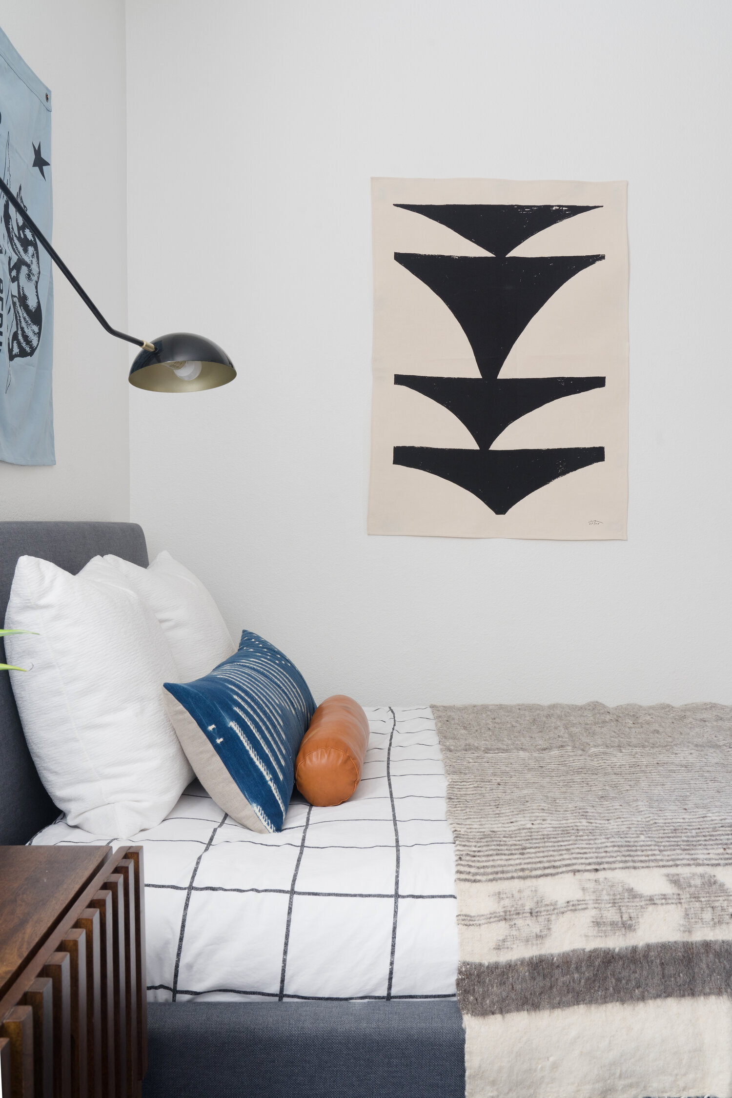
Bedroom from Project Sitio/ Photography: Charlotte LeaLocal Maker:  Upton Home /Textile canvas art/

Bedroom from Project Sitio/ Photography: Charlotte Lea

Local Maker: Upton Home /Textile canvas art/

Lucky for us, San Diego has no shortage of creative makers of all types. You can even spot some of these local creatives in some of our projects, old and new. So if you’re in San Diego and want to know a good list of local artists and makers, this is the blog post for you! Even if you aren’t in San Diego but need a home décor inspiration boost, we’ve got you covered!

MOOD: WARM MODERN

Hey Everyone! It’s Nicole here, (En Shell) contributing to the a Naber Design blog!

Maybe it’s the weather that’s starting to heat up, but it’s safe to say that I have been embracing this warm modern mood that I keep seeing swirling around the interiors realm. We’re talking caramel-toned browns, tans, ivories, and all the yummy neutrals. Throw in some black for an extra level of moody contrast, and you have me over here swooning. There’s something so cozy yet so clean and open about this look. Lately, I’ve been loving the idea of pairing sculptural shapes and forms with clean and crisp lines. Add in layers of textures mixed with rich natural materials, and you have the key to my heart. So while I’m in that warm minimalism frame of mind, here’s a little moodboard to inspire you, too. Enjoy!

Warm Modern

Warm Modern

Source: www.anaberdesign.com

PROJECT HIGHLIGHT: Project Blue Lake Tile Selections

Today, I’m diving into a recent renovation project: #ProjectBlueLake. If you haven’t had a chance to see any images from this project, I will tell you it’s very “tile forward” and in the best way possible!

If you know one thing about me, it’s that I love a good tile. So I’m very excited to go behind the scenes a bit with you and share my selections (all from Clay Imports) for a bold and patterned kid bath.

To back up a bit, Clay Imports is located in Austin, Texas (which is one of my favorite cities to visit.) I love finding smaller shops to source from, and they have quite an array of product ranging in material, color, and pattern. When I started this project over a year ago, I was brought on at a point where the plans were drawn up but no finish selections had been made by the clients. They knew they wanted something fun and bold for their kid bath which both their son and daughter would share.

I gathered dozens upon dozens of selections to present- varying blues and greens accompanied by graphic black and white patterns for a shower surround. The clients had done their homework, and the repetition in their inspiration images showed a graphic type of tile as one selection accompanied by perhaps a solid hue of some sort. Material at that point was up in the air….

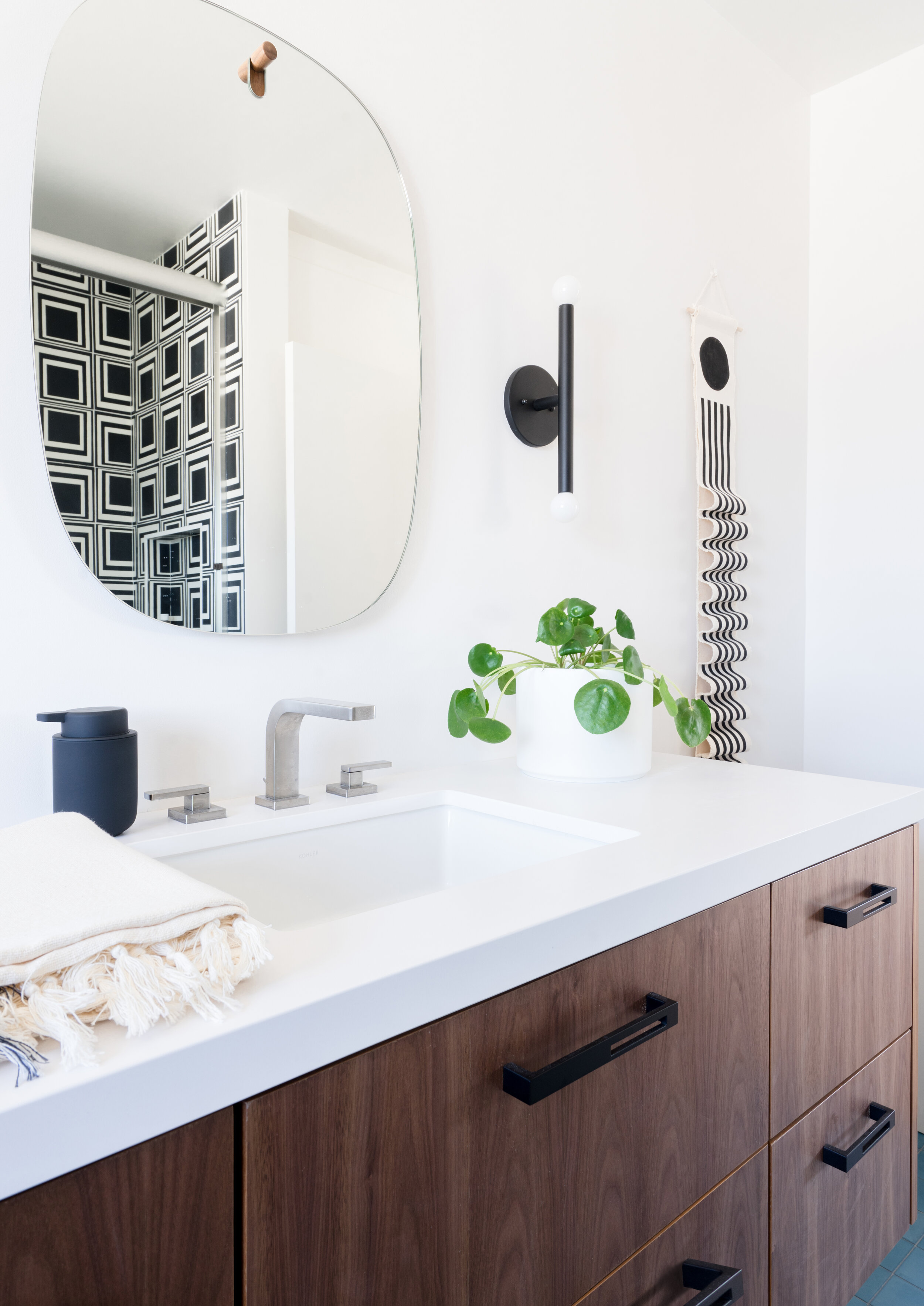
Within minutes, we had zoned in on this “Square Layers” clay tile which is part of the Stone Textile Studios series. Talk about a first impression! The choice was daring, bold and edgy, which was exactly what the client wanted. This set the stage for the space, and after selecting this 8x8, I knew what direction to head next.

With the black and white tile accompanied by a walnut vanity, I knew that we needed to add in color. I also knew that I wanted to play with scale and opt for something that would be smaller in size compared to the shower surround. Without hesitation, we all unanimously gravitated towards the Ocean hued cement tile in a 4x4. This truly is THE best blue hue.

A peek of the Ocean floor tile accompanied by the shower surround/ Photography: Charlotte Lea Photography

A peek of the Ocean floor tile accompanied by the shower surround/ Photography: Charlotte Lea Photography

The result? A fun, graphic space that the kids will enjoy for years to come. If you are looking to source unique tile, definitely check out Clay Imports! They have a variety of material selection, color selection, and feature a variety of unique products under the umbrella of their “Artist Series.” I’ve linked a few additional favorites from this series below:

Xo,

Abbie

PARTNERSHIP WITH CAESARSTONE US- TALKING SHELFIE 101

Oh, the shelfie- Regarded as the ultimate styling project for some but a dread for others. If you're part of the latter group, don't worry, I've got you covered! I've teamed up with Caesarstone US and their Interior Collective series to discuss tips on how to style that shelf correctly. Head on over to check it out! Link is listed below!

Interior Collective 

PARTNERSHIP WITH CAESARSTONE USA AND THEIR INTERIOR COLLECTIVE BLOG SERIES

I admit it, I've once again neglected my own blog, but I have some exciting news to share with you today! I've partnered up with Caesarstone USA and their Interior Collective Blog which is an accumulation of all things design, renovation, and "how to." Today, we are talking about transforming a sad bathroom into a Mid Century inspired space. I don't want to give too much away, but if you're looking to redesign a bathroom and need some inspiration, check out the link that I've included below! 

INTERIOR COLLECTIVE BLOG- CAESARSTONE USA


A MID CENTURY INSPIRED BATHROOM RENOVATION

A MID CENTURY INSPIRED BATHROOM RENOVATION